Upgrading a Campground Website
Based on similar projects we've completed for other campgrounds, the owners of Triple R Camping Resort were confident that we could help update and provide guidance to enhance their web presence. We proposed some new features and design ideas that would improve the overall look and feel of their slightly outdated website, without taking away from any of its original appeal.
- Website


A Slight Shift in Design
Hesitant to make any major changes to the formatting, layout and design of the original site, after presenting Triple R Camping Resort with similar campground work we've completed in the past, they knew that we would be able to effectively update their website in a way that still maintained their original look and feel.
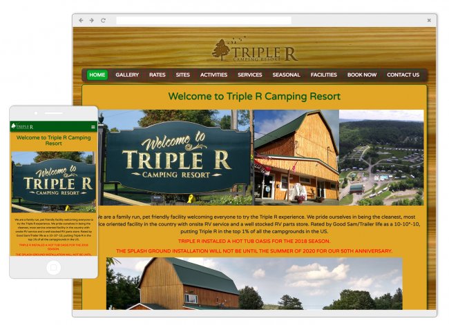
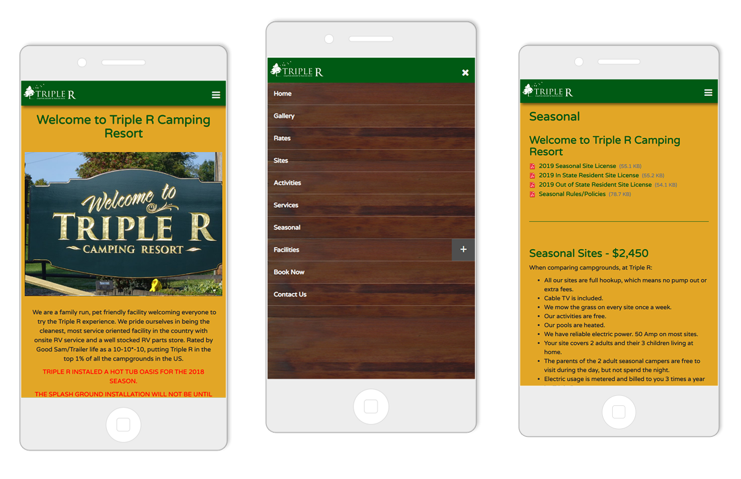
Our main focus when updating the overall design of the new site was to modernize it. Keeping the end-user in mind, our goal was to make the site more visually-appealing, engaging, straightforward and of course, responsive.
We knew that it was important to Triple R to keep their website looking relatively similar to the original one. By maintaining the same color scheme, imagery and appeal that they were comfortable with, we took the original concepts and brought them up-to-date with a more responsive and appealing layout that would speak more effectively to their audience.
Ease-of-Use
Triple R Camping Resort's audience (like most target audiences these days) were accessing most of their information through their phones. That's why it was essential to incorporate Responsive Web Design (RWD) when updating their website.
Now, the Triple R website is easily viewable on all devices in all formats including tablets, mini-tablets, smartphones and desktops.


