Time for an Update
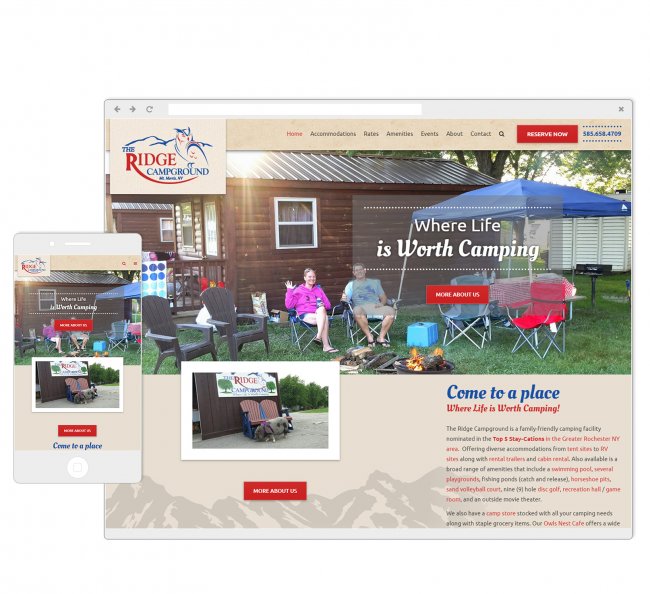
Our main focus when implementing the new-and-improved website for The Ridge Campground was to make it just as visually-stimulating as it would be functional. Known to be a family-friendly campground, we wanted to showcase this element through the use of imagery used on their site.
But eye-catching photos weren't the only important factor when updating the site - functionality is key. We developed the website with the user in mind, ensuring that it would be easy to navigate, either on a desktop or mobile device.
- Website


Organizing the Main Navigation
We worked closely with The Ridge Campground to help and organize their content into main navigation tabs. Our goal for the main navigation was to make it as clear, clean and intuitive as possible so it would be the easiest and most effective for all users. After determining these top-level sections for the main navigation, the rest of the content was appropriately allocated as sub-level content, making it easy for visitors to navigate through the site to find the specific information they were searching for.

