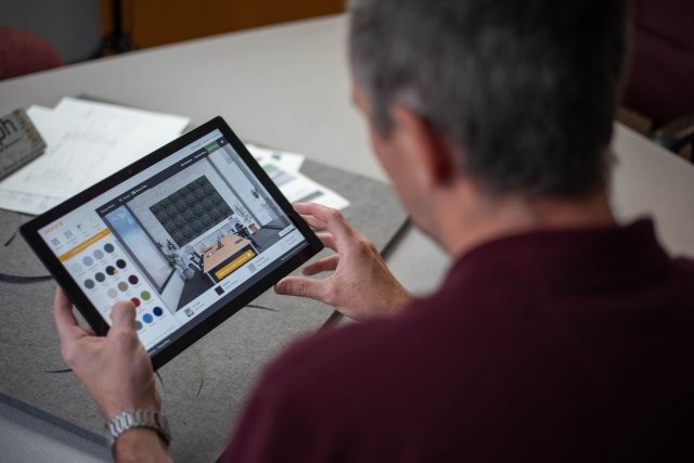
For nearly 17 years, Corporate Communications has been working with Takeform to expand their business from a small sign shop to an industry leader in signage design and architectural graphics.
In 2015, our digital marketing efforts included an entire website redesign. Recently, we helped Takeform develop a web app – Oomph Pattern Visualizer -- that gives their customers full design and creative control.
This new interactive design tool allows users to customize, preview, and order all aspects of Takeform’s Oomph Acoustic Adaptive Panel System for office spaces, workstations, and freestanding elements. Serving as both a sales tool and productivity app, thousands of material, pattern, and color combinations can be previewed in just seconds, which would otherwise only be possible with a graphic designer’s help.
- Web App
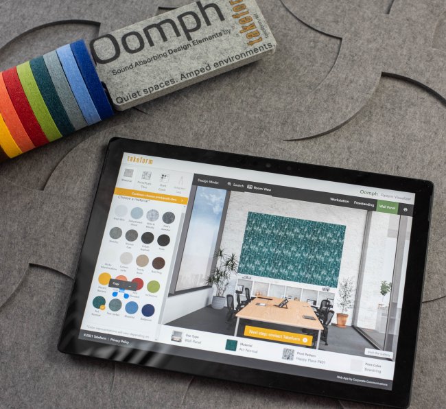
Fully Customizable Design Tool
The Oomph Pattern Visualizer is an innovative design tool for facilities managers, interior designers, and Takeform reps. Users can choose materials, patterns, print colors, and even hardware adapter colors – all playing a role in creative branding. Then seamlessly preview thousands of combinations in one of several design modes: wall paneling, workstations, free-standing office environments, or an enlarged swatch.
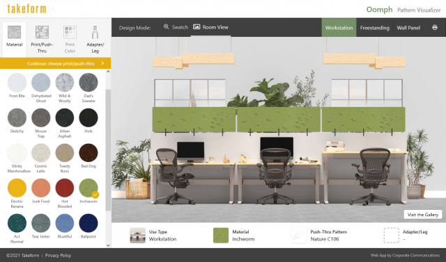

After creating the desired material, print, and color combination, users will be able to print and download high-fidelity design renderings, contact Takeform, and place an order.
Hit a creative roadblock? View Takeform’s Oomph gallery and garner inspiration from thousands of branded designs.
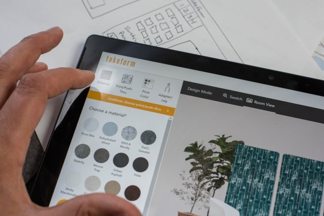
Design Process with the User in Mind
With a long history of working with Takeform, we understand their customers and market well. From the moment this project began, we worked collaboratively with Takeform’s design team to understand the product and their customer’s needs even further.
To ensure our due diligence, we took note of feedback received from other design tools we’ve created in the past to help inform design decisions moving forward. From there, our web developers and designers outlined key features and analyzed how the new tool will function, created wireframes and an interactive prototype, and underwent internal user testing to gain valuable feedback.
Our Process: Engineering and Execution
With an emphasis on performance and accessibility, we wanted to ensure the web app loads quickly and responds well to user input. Our developers utilized modern front-end frameworks to provide a fluid, app-like experience.
Additionally, we worked directly with the 3D modeler to generate necessary assets for the visualizer and collaborated with Takeform every step of the way to ensure the end result was an accurate representation of their product needs.
