A hand-crafted web design to boost online sales
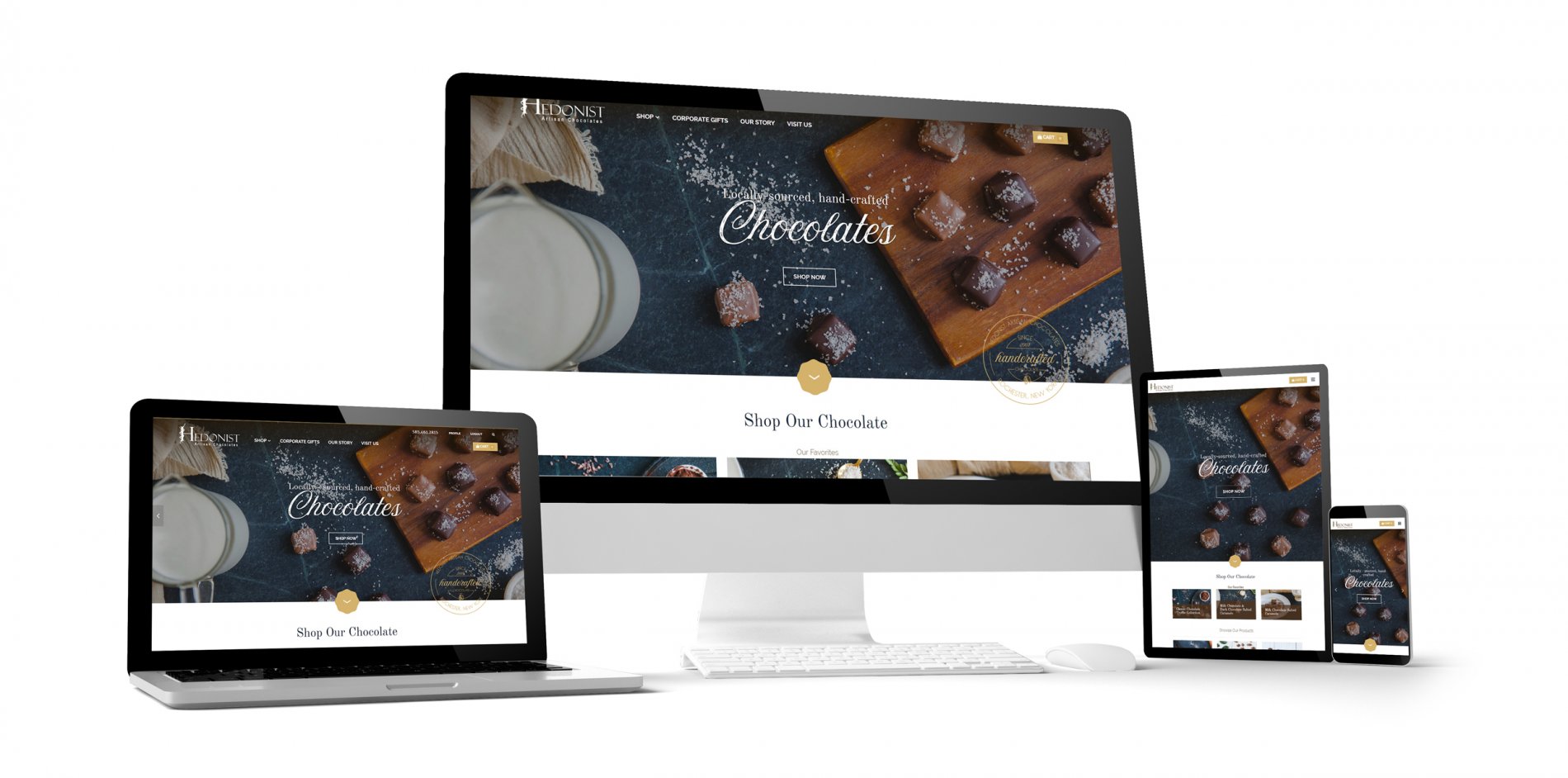
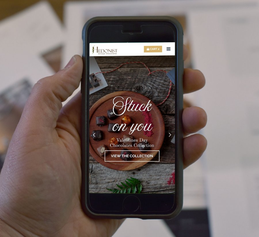
Hedonist came to us to create a website that would expand the reach of the iconic brand to a national audience and increase online sales. Already with a significant following locally, they needed to convey their brand promise of having unique, high-end treats for holiday gifts, corporate gifts and special events. We designed and built a custom website and e-commerce store that reflects this brand image and has proven to increase sales. Launched right before Valentine’s Day, it had the effect of having their best online sales month to-date. We are also involved in ongoing SEO and Social Media Marketing.
- Website
- SEO
- Social


A beautiful, functional design
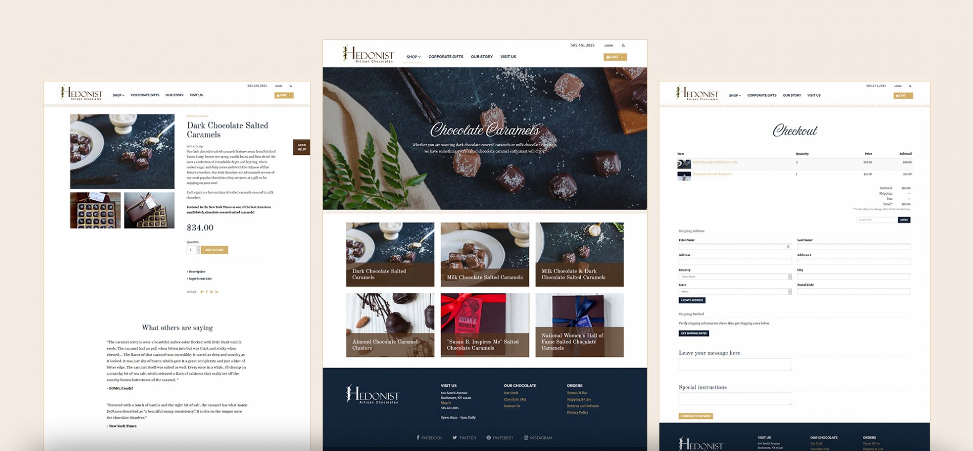
In redesigning a new e-commerce website, it is important to look at all aspects of the customer experience. Sure, they needed a beautiful visual design, but with Hedonist, we took a detailed look at their products and created a site architecture that was easy to navigate and takes into consideration the many types of customers. Then we moved into creating a look to match newly designed packaging and expressed the quality of their locally-sourced, hand-crafted chocolates. We chose a subdued color palette (navy, gold, brown) and clean layout that lets the texture of the products stand out. Photography was very important to the design as well, we worked with the team at Hedonist and photographer Hannah Betts to create a look that gives a stylized look to the entire site.
An improved online shopping experience
In designing the e-commerce portion of the website, careful attention was paid to the product page that included some not-so-typical features that improved the buying experience. First we included a grid of product photos that changes depending on how many are available, an improvement to standard thumbnail photos. Next, we devised a box quantity selector where you can choose between different gift box sizes and quantities without having a new product page. And since many products can have a custom printed card, we created a place in the checkout process to choose a ribbon color and add text for your note card.


