Reimagining a New Site for a Historic Brand
DiBella’s wanted a site that was both functional and easy-to-use, a site that showcases its 90+ year history with a modernized touch, a site that made the ordering process simple, and a site that made their subs look like works of art. We made that happen. From diving into the complicated intricacies of Version Tracking and Simplified Retrieval to simply making sure the mustard really “pops” on the homepage, Corporate Communications took a look at every inch of DiBella’s website and we are more than happy with the final product. We focused on improving the visual appearance of the site while maintaining its historic brand. We gave DiBella’s the ability to easily create landing pages for any kind of new promotion they’re doing. We made sure their site works – and works well – on all platforms. We truly did all we could to make this site the best it can be… and we’ve never craved subs more.
- Website
- Brand Strategy

Telling the DiBella’s Story
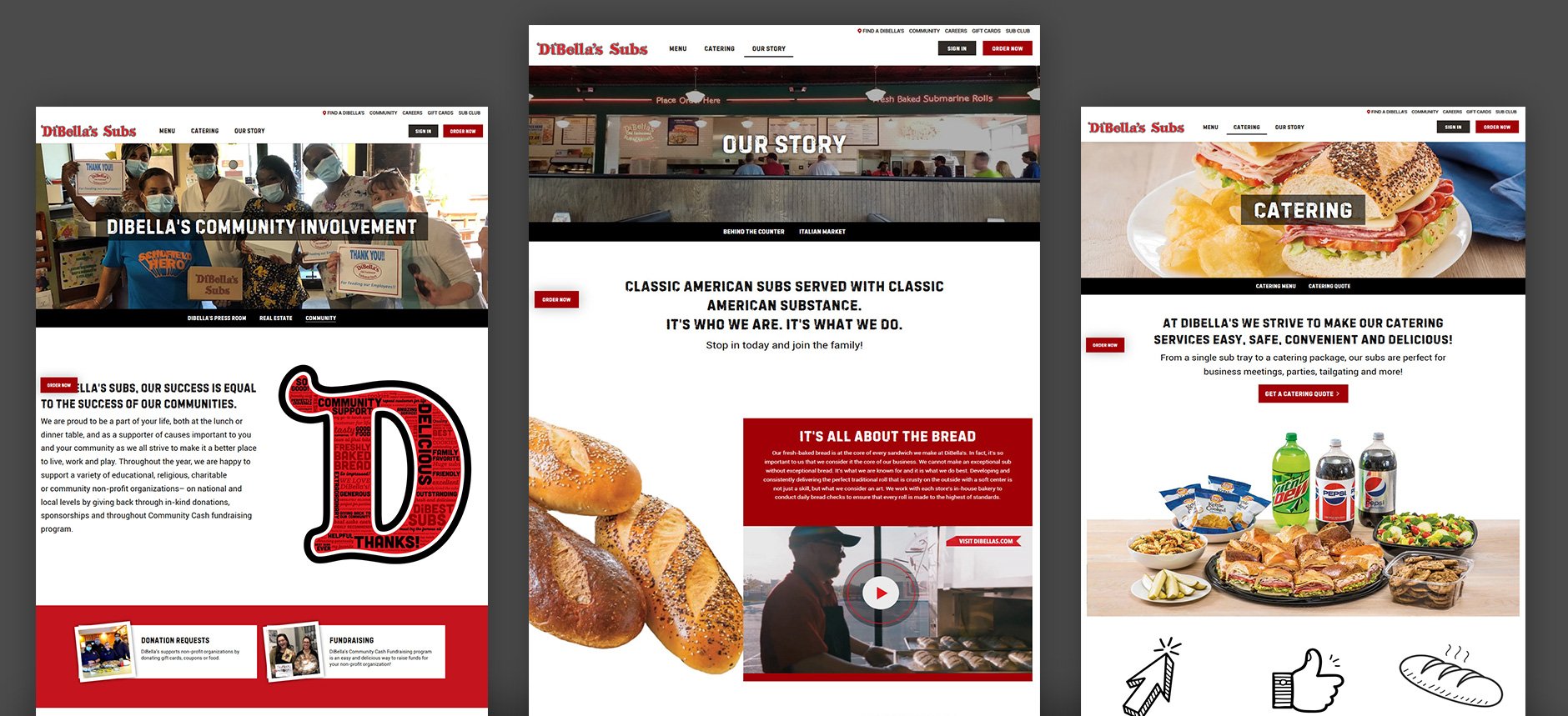
Without a doubt, DiBella’s website looks much better than it did in 1918. DiBella’s came to us to create a website that doesn’t just look great, but is easy-to-navigate, emphasizes its strong community involvement, and showcases its 90+ year history of quality. By focusing on aesthetic updates to the site, we put a modern spin on the vintage feel of DiBella’s through reimagined type, layout, and visual style. From the moment a customer arrives on DiBella’s website, they will appreciate the historic touch of the design, a slick and responsive navigation bar, and… the food. All that delicious-looking, eye-catching, and mouth-watering food. Hopefully, they arrive hungry.

A Design System for All Digital Platforms
We wanted to ensure the new design system created brand consistency across all digital platforms. Whether a customer is looking to place an order on their lunchbreak, get a catering quote for an upcoming event, or simply learn more about DiBella’s inspiring history, they’ll find everything they need -- quickly -- on all devices for an enhanced user experience. DiBella’s site is more responsive and now works through integrations with 3rd party apps, including online ordering using APIs and their coveted Sub Club.


Easy to Navigate Online Menu
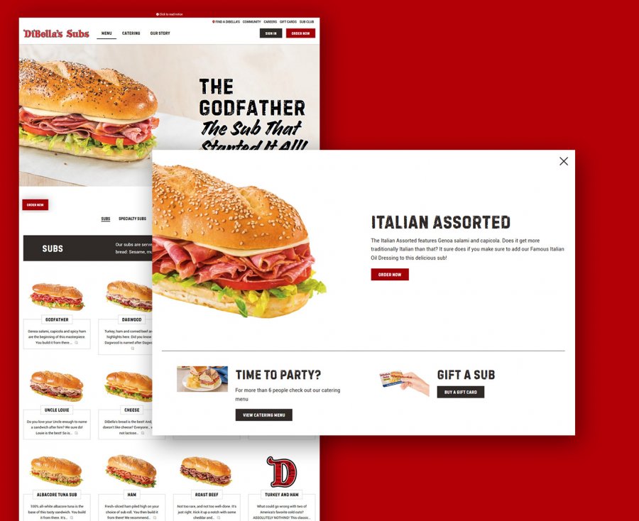
Speaking of food… DiBella’s menu is where you’ll find all those classic subs, salads, cookies, sides, and kids meals (applesauce and crayons included)! We created an easy-to-navigate menu with large images and detailed descriptions. We also focused on integrating upselling opportunities throughout both the main menu and catering menu. Featured at the top of the menu is The Godfather - the sub that started it all. It’s almost impossible not to click that “Order Now” button.
Comprehensive Content Management System
We wanted to help DiBella’s with their content management system (CMS) by giving them the ability to easily create landing pages for future promotions. Additionally, thanks to our updates on Version Tracking and Simplified Retrieval, they can now seamlessly create and replicate data collection forms to monitor information, virtually ‘Go Back in Time,’ and build stronger customer relationships.

