Updating a Site That Supports Cancer Patients and Their Families
Cancer Support Community at Gilda’s Club Rochester came to us for a website overhaul. Their previous site was outdated, making it challenging for cancer patients and their families to navigate and access critical resources. Recognizing the importance of a well-organized and accessible online presence, we redesigned their website with a modern look, restructured the information architecture for intuitive navigation, and ensured it was accessible for all. Our goal was to create a user-friendly platform where individuals could easily find the support and information they needed during their cancer journey.
- Website
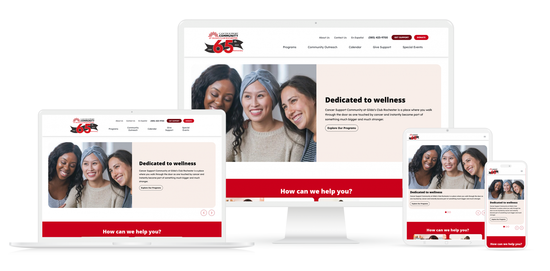
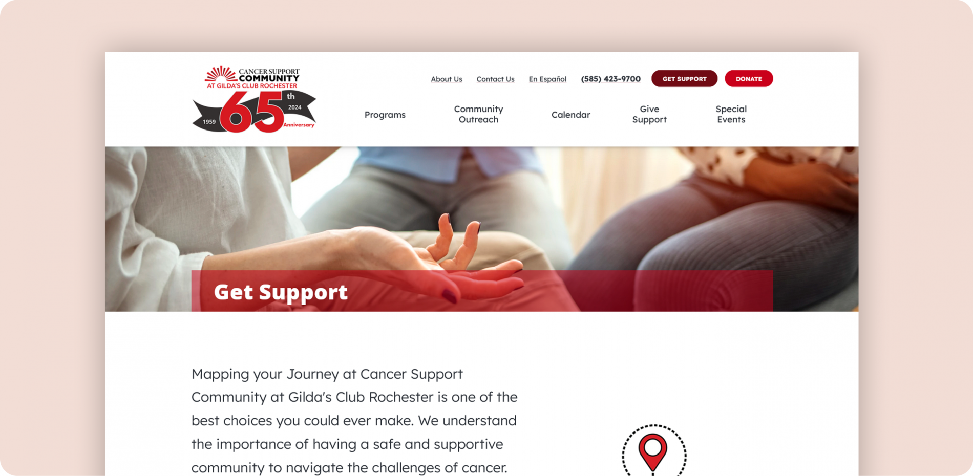
Intuitive Site Design
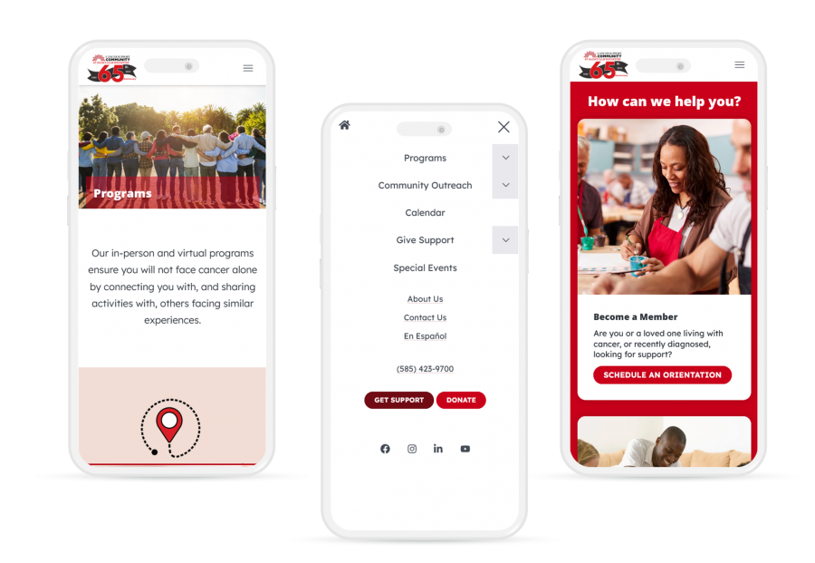
Cancer Support Community’s previous site was outdated and needed an overhaul of the site design and how content was laid out. We got to work making changes to their site that gave it a more modern and welcoming feel, along with re-organizing their navigation, allowing users to easily and quickly find the information they need. Navigating a cancer diagnosis is hard enough, finding support and vital resources shouldn’t be. It was also important for their site to be mobile-compatible, allowing cancer patients and their families to browse resources between appointments and treatments.
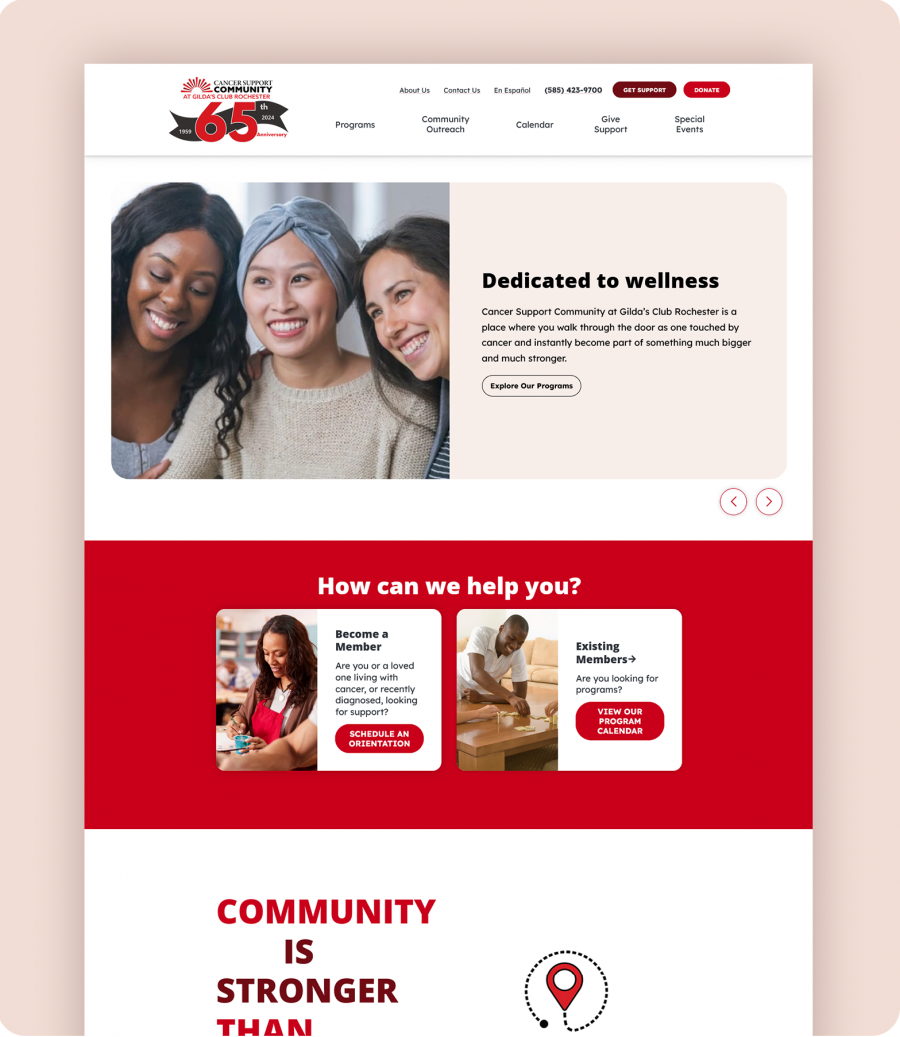
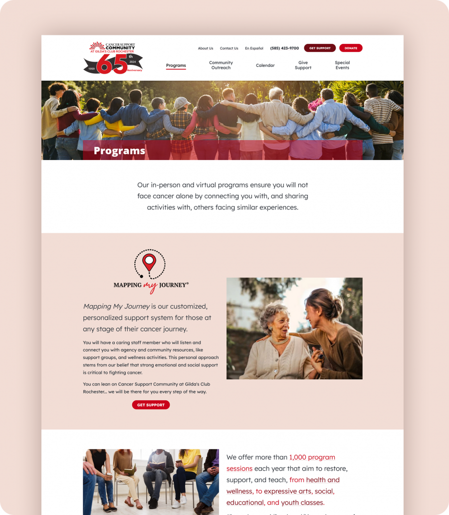
Streamlining Access to Critical Information
Understanding that ease of access to information is important for Cancer Support Community's visitors, we undertook a thorough re-organization of their website’s information. We analyzed the existing structure and identified areas of improvement. We then restructured the site to ensure a logical flow of information, making it simpler for users to find the support and resources they need. This re-organization not only improves user experience but also enhances the site's overall functionality, enabling quicker access to support services, educational materials, and community events.


