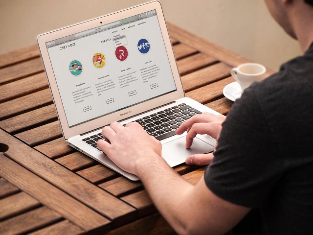
One of the most overwhelming parts when it comes time to layout a website is trying to figure out what content will go where. Planning and organizing content is stressful in itself, especially when new web design is factored in.
But really, it’s nothing to stress about. Organizing web content is really as simple as breaking everything down into main categories and then filling in the blanks from there.
For any visual learners out there, think of it as a menu; You have your main categories to choose from and then from there you choose from the “drop down” list of more specific dishes.

The first and most important step is deciding what those main categories will be.
Generally speaking, it’s a good idea to have no more than around five main categories. Anything more than that can become overwhelming for users. Not to mention, too many main navigation options appear to be much less aesthetically pleasing for your website. The main goal is to avoid any clutter.
Deciding on a main menu, it’s important to keep your audience in mind from beginning to end.
The main navigation should clearly and effectively be able to direct your audience in the right direction at just a quick glance. People like things that are quick and simple to understand. So, if your audience can’t immediately find what it is they’re looking for, it shouldn’t be a main category.
With this in mind, the three most popular pages generally are home pages, about sections and contact pages. The beauty of these pages is that you can explain so much in so little pages.
A homepage is a place to grab attention.
Give your audience a taste of who you are, what you do and what you can offer. By no means is your homepage the right place to go too in-depth on anything, but it should certainly effectively give people an idea of what they’re in for.
The goal is to capture your audience right off the bat, whether you do so through your content, imagery, videos or calls-to-action.
Your ‘About’ page is your chance to tell your story.
Who are you? What do you do? How did your business come about? What makes you different?
If there’s any page to get extra wordy on, it’s the about page. Your audience is going to want to know what sets you apart from everyone else and what’s in it for them.
Lastly is the ‘Contact Us’ page.
A clear call-to-action: Contact Us. If your website has done its job well, people will be flocking to your contact page so they can further explore your services.
But, organizing content isn’t as simple as sorting things under these three main umbrellas.
You didn’t think it’d really be that simple, did you?
Sure, these three main navigation tabs are the most popular and widely-used across websites, but some businesses and organizations with have other tabs that are more specific to their business.
For example, campgrounds may have a tab for ‘accommodations.’
Your main navigation should only showcase what is the most relevant to your brand. If you’re still unsure what categories are most important to your brand, a great place to start is Google Analytics. Through this data, you can access valuable stats that can show you your audience demographic, specific pages they’re going to and what content performs the best.
After you’ve pinpointed your main categories, all of your other content can be sifted through and organized into these silos by creating relevant landing pages to be included under each category.
Making multiple landing pages is essential because not all visitors will come directly to your home page. Some will find you through different pages that are more specific to what they’re searching for. Each service should have its own page. These entry points will be convenient for your end-users.
So, when it comes down to it, it's really just a matter of deciphering what content is important enough to include as a main category, and what corresponding content can be included as a drop down for each section.

