


We’ve been talking about it, the internet marketing industry has been talking about it, even USA Today and other major news outlets have been talking about it… the Google algorithm update that was implemented on April 21 dubbed #mobilegeddon.
If your site is not yet mobile-friendly (and if you’re not sure, you can use Google’s Mobile-Friendly Test Tool), have you taken a look at your analytics to see if it’s made an impact?
Search traffic to a website from a mobile device is growing – and rapidly. Google has been letting us know for a long time that they understand the importance of mobile-friendly results for their users and now they are actually putting that into practice by using it as a factor in how they rank websites.
If your website is not mobile-friendly, if it hasn’t already, it will most likely see a drop in ranking on mobile devices (this includes tablets). While important for everyone with the growing use of mobile devices to search the internet, it is especially important for local businesses as many people use their mobile devices to search the internet while traveling when looking for a place locally to get to – retail stores, restaurants, gas stations, service businesses, the list goes on…
In addition, although this algorithm is only directly affecting results in mobile device searches right now, it may very well affect desktop results as well as pay-per-click advertising in the not-too-distant future.
How to Check Your Analytics
If you haven’t done so yet, it’s important to check your website stats in whatever analytics tool you're using – whether it’s Google Analytics or some other tracking tool. Even if your website is mobile-friendly, it’s still a good idea to regularly check on your analytics to see how your site is performing form a mobile perspective.
To get a general overview of your mobile traffic in Google Analytics, do the following:
- Once logged in, go to Audience and then Mobile.
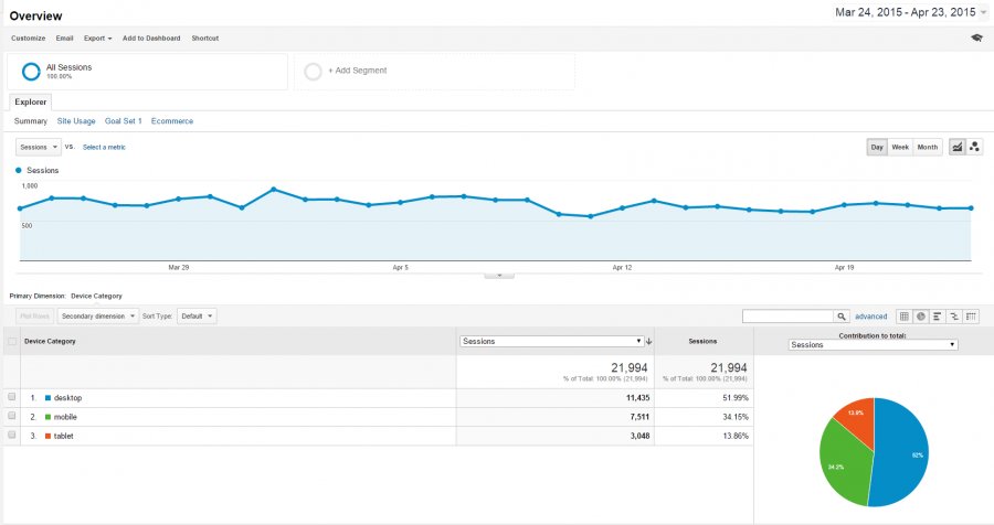
- By selecting Overview, you’ll get a breakdown of users that visit your site from desktop, mobile, or tablet.
- You can change the timeframe of statistics you’re looking at by changing the date range in the top right corner. Using the date range you can also compare your stats to a previous period of time of your selection.
Note: Depending on the type of information you’re looking for, I often recommend looking at data year over year as seasonality can have an impact on your website’s overall traffic and you’ll get a better representation of a change in statistics by comparing the same time of year. Google Analytics actually makes this easy for you to do by providing a drop down with the selection ‘Previous Year’. - To look at a breakdown of mobile traffic by type of device, under the Mobile section, select Devices (under Overview) and you’ll get a breakdown of the type of mobile devices being used to access your website.
Overview of Website Views from Mobile Devices (including Tablets) vs. Desktop
In addition to taking a look at this general overview of your mobile traffic, using Google analytics you can easily incorporate mobile statistics into almost any report. So, for example, if you wanted to see how much mobile traffic you get specifically from Google, here is one way to access that information:
- Go to Acquisition, and from there, go to All Traffic. Under All traffic, select Source/Medium.
- Once on that page, click on Google / Organic to isolate data just from that source.
- You can then add what is called a Secondary dimension (your primary dimension is Source/Medium). To do that, click on Secondary dimension under the graph, go to Users, and then you have the option for a few different mobile-related set of data.
- By selecting: Mobile (Including Tablet), you will get general information on who access the website through Google using a mobile device – including tablets.
- The other selections, including: Mobile Device Branding, Mobile Device Info, Mobile Device Marketing Name, Mobile Device Model, and Mobile Input Selector, will provide you information on specifics of the type of mobile device used including brand, model and type.
Just as in the above example, you can select a specific date range. So, if your site is not mobile-friendly, you may want to do a date range of sometime after #Mobilegeddon, and compare it to the same time amount of time from before the algorithm change was implemented to get an idea of the impact. I would recommend doing this on an on-going basis if your site is not yet mobile friendly to see how this change may be affecting traffic to your website.
Overview of Website Views Driven by Google Search from Mobile Devices (including Tablets) vs. Desktop
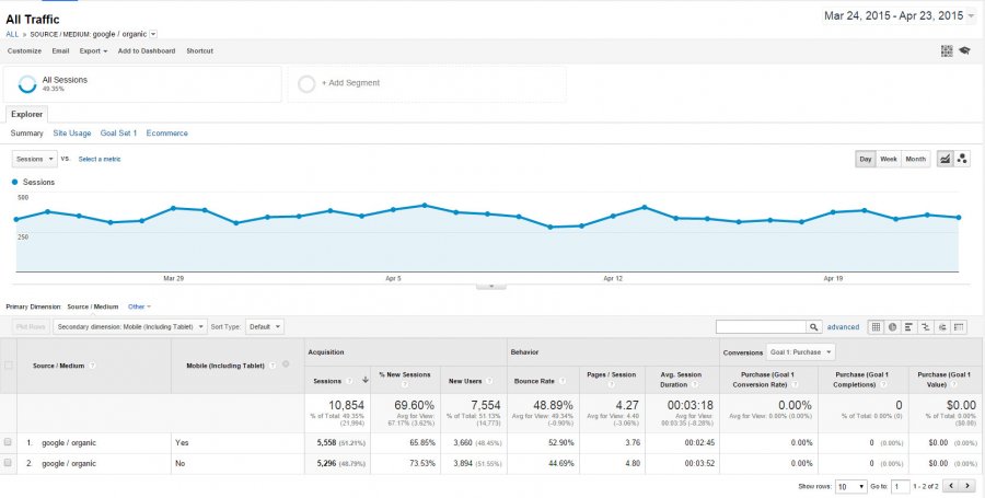
If you take a look at the above report, you'll see that over the past seven days, of this particular website's traffic coming from Google (Organic), over 50% has come from a visitor using a mobile device (this includes tablets). This website is mobile-friendly using a responsive design, and therefore should not see impact from #mobilegeddon, or if it does, will be a positive one.
In addition to concern about your website rank in Google mobile results, if you don’t yet have a mobile-friendly site, you should also be concerned about usability for your visitors. If someone does get to your website on a mobile device and it is difficult to read and use, you will very likely lose that potential customer to someone else who does have a mobile-friendly website.
In many cases, a conversion of your current website design to responsive can be done to make your website mobile-friendly. A responsive design can be viewed easily at any screen size, giving it more longevity as different sized mobile devices continue to go on the market.
Find the author on social media:
+Elissa Mitchell
@ezmitchell